Design System:
High contribution to a team endeavor
Recent design system work focused on developing an improving existing elements already in use. Our goal was to rebuild the system with a simpler approach for our customer and ability to update when needed to match our other brands.
These images are low fidelity photos. Please schedule an interview to see Figma files and details!
Project contributions:
Partner website and branding guidelines analysis
Type style research and initial proposals to team
Color studies and contrast checking
Review of existing spacing guides
Module design
WCAG color contrast review and updates
Component and style formatting and creation for design system
Presentation to product partners and leadership
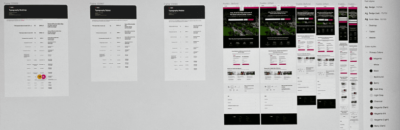
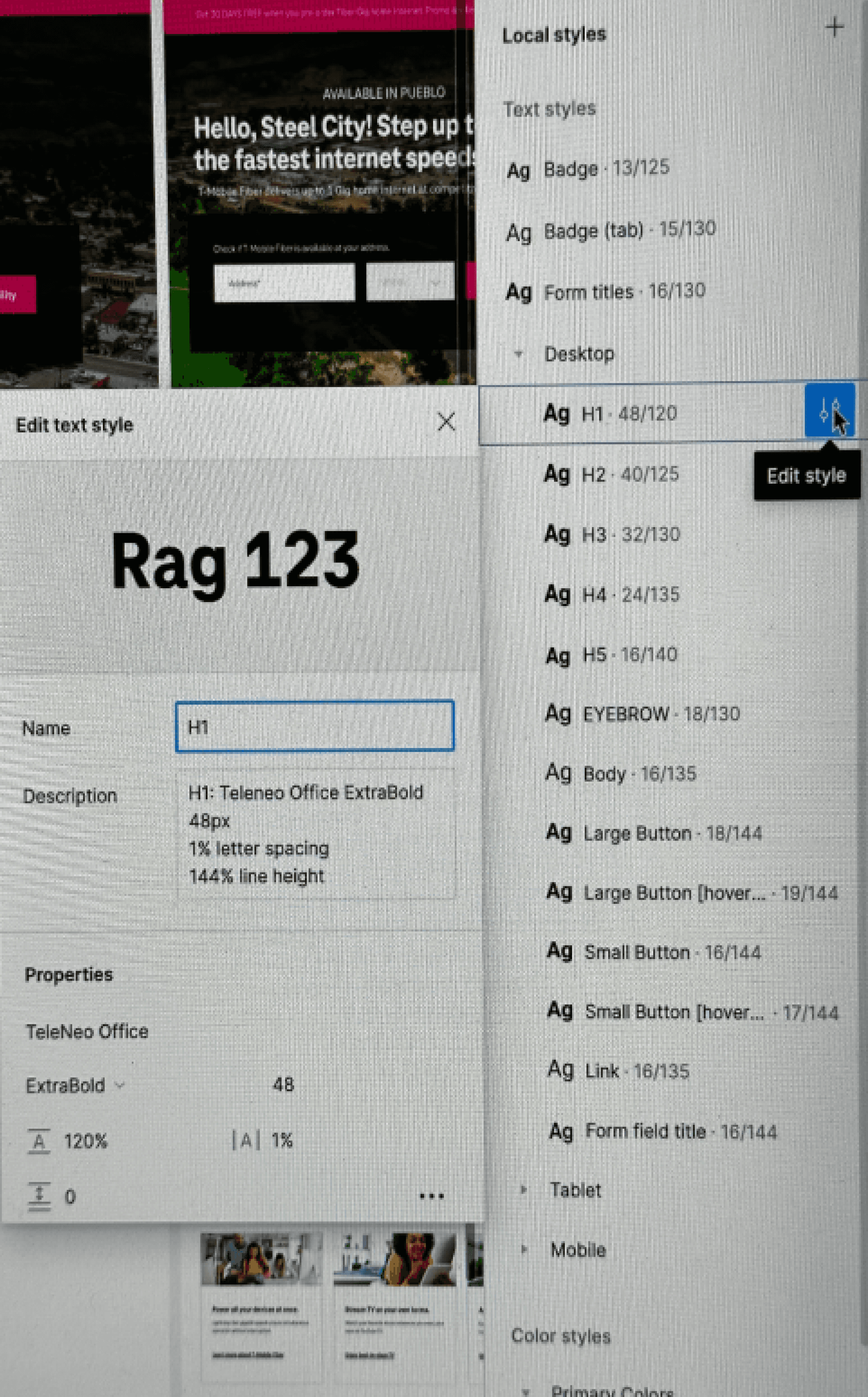
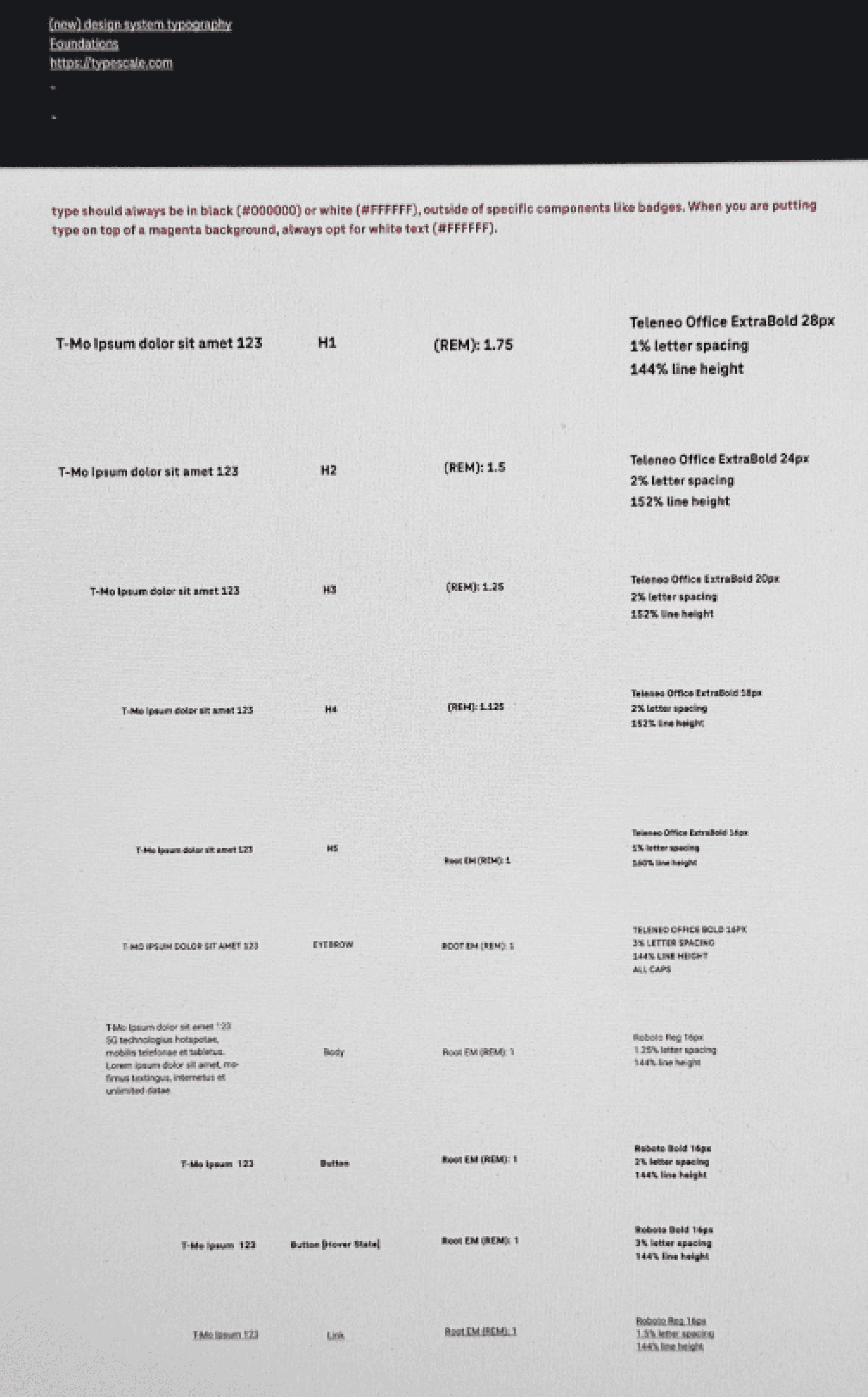
Type styles
Using a branded font our type styles were purposely picked for impact and ensuring the design team had confidence in style selection for all web app breakpoints.
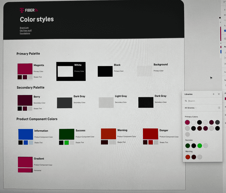
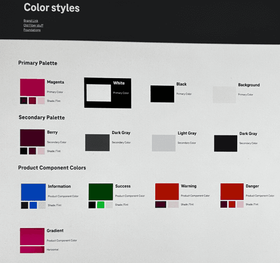
Color styles
Our colors follow corporate branding guidelines for primary, secondary, tertiary colors and a simplified state color system. Later, a gradient was added as a color option to ensure guidelines were followed by all designers working in this system.